The Illusion:
The Craft of Building It.
How the projected illusion actually works, the effects grammar that makes architecture lie convincingly, how immersive spaces are designed around the people inside them, how stories and sound are written for places instead of screens, how the content gets made, and how to choose between the world's surfaces and one you commission. Part one covers where this industry is heading; the physics behind every claim here lives in part three.
The Instrument: Light on Geometry
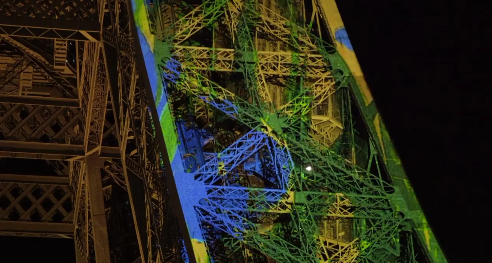
Stand in a crowd at a good building mapping and watch the façade split open, or the columns turn to water, and your eyes will report, flatly and unanimously, that the architecture is moving. Every stone, meanwhile, is exactly where it was at lunchtime. What moved is light, shaped to the geometry of the object so precisely that the object and the image become impossible to separate.
That is the whole definition. Projection mapping, video mapping, spatial augmented reality, whatever a given decade calls it, is projection where the image is designed for the specific three-dimensional thing it lands on rather than for a rectangle. The projector does not know it is doing anything special. The intelligence lives in the content, which has been warped, masked and lit so that edges in the video land on edges in the world.
Once the image and the object agree about where the edges are, you can lie to an audience with remarkable authority. Paint the mortar lines and the stone reads as stone. Slide them sideways and the wall reads as sliding. Light one column and leave its twin dark, and depth appears that no flat screen has ever produced, because the depth is real. The object supplies the parallax and the shadows honestly; the light supplies everything else. This is the trick under the façade show and the immersive hall alike: the hall is simply a mapping whose object is the venue itself, with the audience placed inside the illusion instead of in front of it.
None of this is new, and the history is reassuring. Disney was projecting faces onto plaster busts in the Haunted Mansion in 1969. What changed is the economics. Bright projectors used to be a broadcast-budget item; they are now within reach of a mid-sized venue, a festival, a brand launch. The software that once demanded a specialist now runs on a good laptop. The craft got cheaper to attempt without getting any easier, which is why a handbook like this exists.
It also runs on every scale at once, which people forget. The same technique that fills a cathedral fills a costume: mapping has been performed on a singer's dress live at an awards show, on arena ice between periods, on a basketball court before tip-off, on banquet stairs, on a rocket on its pad, on a single table in a restaurant for eight guests a night. A club or a mid-sized venue can field a real mapping with one bright projector, off-the-shelf mapping software and a good laptop, for less than the cost of a few flat panels. The ceiling of the craft is a stadium; the floor is a weekend and a credit card, and the physics in this handbook is the same at both ends.
The audience does not experience light and geometry separately. They experience one thing, and it is the seam between the two that decides whether it feels like magic or like a video on a wall.
The Grammar of Edges
Mapping has an effects vocabulary the way film editing has cuts, and it is small enough to learn in a chapter. Nearly every mapped moment an audience has ever gasped at is one of about eight moves, alone or layered, and all eight depend on the same precondition: the audience must first believe the light and the object are one thing.
Establish the Real
Which is why nearly every good mapping opens the same way: by showing the object as itself. The façade's own edges traced in light, its windows lit as windows, its true colors gently amplified. That restraint is grammar rather than caution: the opening minute welds image to geometry in the audience's perception, so that every later violation, the wall that breathes, the tower that detaches, lands with the full force of a broken law of physics. Skip the establishment and the show reads as video from the first frame; the audience never signs the contract you are about to breach.
The Eight Moves
- Tracing. Drawing the object's own edges, mouldings and joints in moving light. The simplest move, the standard opening, and still the cleanest demonstration that the show knows where the building is.
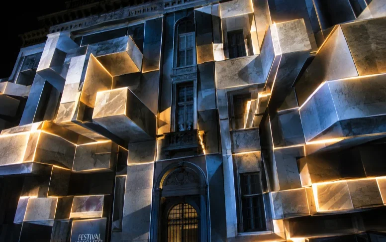
- Reskinning. Swapping the object's material while keeping its geometry: stone becomes brushed gold, glass, moss, circuitry, water. The mind accepts the new material completely because every shadow and edge stays honest. This is the workhorse of the form.
- Counterfeit light. Painting highlights and shadows that contradict the real lighting: a sunrise crawling across a façade at midnight, a raking side-light that exists nowhere. The eye trusts shading more than it trusts its own knowledge of where the sun is, and the object appears physically re-lit.
- Extrusion and collapse. Geometry appearing to grow out of the surface or crumble from it: columns telescoping, walls folding into origami, bricks tumbling. The move relies on the perspective being computed from the audience's position, which is why it is strongest where the crowd is concentrated and weakest at the flanks; designers place the boldest extrusions where the sightline math holds.
- The X-ray. Peeling the surface to reveal an invented interior: machinery inside a clock tower, a heart inside a statue, rooms inside a wall. An audience never tires of it, because the object they know conceals a world they don't.
- Scale play. Making the enormous small or the small enormous: a hand rearranging the building's blocks, a giant behind it. Architecture-scale surrealism, unavailable to any screen because the scale is real.
- Displacement. The whole object, or a piece of it, appearing to shift, tilt, float or breathe. Used in seconds-long doses; the mind lets an edge move only briefly before it checks against the true silhouette and the spell risks breaking.
- Extinction. The most underrated move: taking the light away. A mapped object going instantly, perfectly dark, or one window remaining lit in a dead-black mass, lands harder than any explosion of color, and it is the move most dependent on the black floor physics of part three and on a surface that can actually disappear.
Two disciplines govern all eight. First, register before you depart: every effect starts from the object's true geometry and returns to it, because the return is what re-arms the illusion for the next move. Second, respect the silhouette: the outline of the real object against the sky or the venue is the one edge the projector cannot repaint, and effects that fight the silhouette (extending past it, contradicting it) read as spill, which is the technical term for the moment the magic dies.
In immersive venues the same grammar operates with one enormous addition: the audience stands inside the object being lied to. Reskinning becomes weather and season; counterfeit light becomes time of day for the whole world; extinction becomes night falling on the whole space. The moves are the same. The subject changes from "that building" to "here", which is a stronger word. The perceptual machinery this grammar plays on, the periphery, the skeptical body, the mind that fills in, is the first part of our thesis: how we experience reality.
The Immersive Space
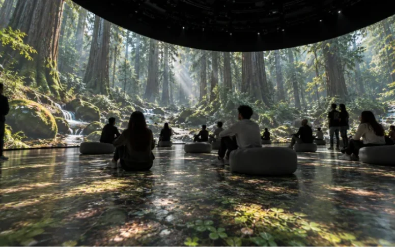
An immersive venue is a mapping turned inside out: the canvas wraps the audience, and every design rule inherits a twist from that inversion. This chapter is the venue-scale rules; the fine physics behind each one lives in part three and in the field guide.
The Visitor Is Inside the Arithmetic
There is no back of the crowd. Someone will stand at touching distance from every surface in the venue, which runs the resolution mathematics of part three's eye chapter at its harshest setting and is why immersive canvases eat channels: flagship immersive exhibitions run canvases past a hundred million pixels. It also changes the floor of the image, literally. Floor projection is standard in wrapped spaces, and the floor is the one surface guaranteed to be occluded by the audience, scuffed by their shoes and viewed at a grazing angle. Design content that survives shadows (fields, textures and water read well; text and faces on floors die), and light the floor from multiple angles so no single body blacks out a scene.
The Space Fights Itself
In a wrapped venue the largest source of ambient light is the show. Every wall's image bounces onto every other wall, onto the ceiling, onto the visitors, and back onto the image, and a bright scene on one side lifts the black on the other. This self-bounce is the defining optical problem of the form. It is fought in the content (a grade that keeps overall light in check), in the architecture (dark, matte finishes everywhere the picture is not), and above all at the surface, where absorptive canvases stop the space from washing itself out. The physics is the field guide's venue chapter with the venue turned all the way up, and it is the single strongest argument for dark surfaces in this industry.
Sound Has Nowhere to Hide
With image on every wall, loudspeakers either puncture the picture or play from behind it, and spatial audio is half the immersion. This is what the Acoustically Transparent family exists for: the system lives behind the image, the mix arrives from where the picture says it should, and the canvas stays unbroken. The insertion loss is small, smooth and correctable with EQ, and the numbers are on the range page. The catch: light passes through an AT weave as well as sound, so everything behind it must be blacked out and treated, or the hidden machinery returns as gray haze. Sound earns its own chapter later in this part.
Domes and Curved Volumes
Domes are the deep end: content authored in fisheye or sliced projections, radial projector arrays, blends that curve in two axes at once, and a seating or standing plan that decides where distortion is allowed to live. They reward the effort with the strongest presence effect in the catalogue, because a dome has no edges for peripheral vision to find; the picture does not end, and the brain stops looking for the exit. Planetarium practice solved most of the geometry decades ago, and the entertainment dome inherits it wholesale.
Curved volumes are also where the projection planner stops being a diagram and starts being a rehearsal: its curved-wall presets carry real geometries, with the projector fleet, portrait or landscape tiling and blend arithmetic already solved. Two are worth opening from here: the three wall wrap, a 20 ft volume with filleted corners and the Los Angeles plate running wall to wall, and the 270° cave, three quarters of a cylinder around the audience. Both load live and editable, one click below.
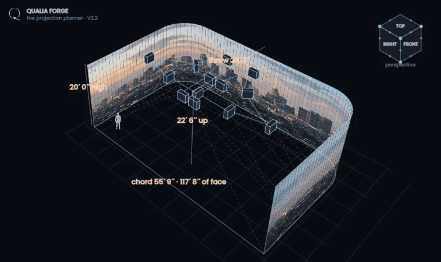 Open the planner ↗
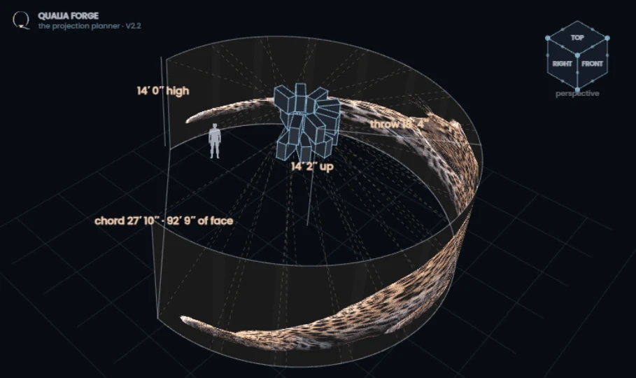 Open the planner ↗
Reveals, Scrims and Layers
Theatres have hidden and revealed scenes behind gauze for two centuries; video upgrades the trick. A Transparent Scrim holds a full image while lit from the projector and dissolves the moment the scene behind it is lit instead: a ghost, a title, a wall of rain, then the performer standing where the image was. Layering scrims in front of opaque surfaces builds genuine depth, image in front of image, that no single canvas can fake. The TS family's transparency ladder is on the range page; the stagecraft is limited mostly by nerve.
Thresholds, Flow and the First Minute
Two venue-design facts that are really optics facts. First, dark adaptation: eyes walking in from a lobby take several minutes to see shadow detail, so the entry sequence is part of the light plan, a dimming corridor, a held first scene, a reason to pause, or the opening minutes of the show play to blind audiences. Second, capacity: throughput decides dwell time, dwell time decides the show's loop length, and the loop length decides content budget, which is how the box office ends up dictating the edit. Design them together or they will fight forever.
Writing for a Space
This chapter is the second age's frontier, and it has no equivalent in any projector manufacturer's white paper. Screens come with a grammar four generations of filmmakers already wrote. Spaces do not. Everything a film director controls with the frame, what you look at, when, from where, has to be achieved in a space by other means, because the visitor owns their own eyes and their own feet. What follows is the working grammar as this industry currently understands it.
The Visitor Is the Camera
There is no frame, so there is no cut, no close-up, no reverse angle. The visitor composes every shot by standing somewhere and looking. Fighting this is the classic first-timer error: content built like a film, played on walls, with the audience missing half of it and sensing vaguely that they are watching television from inside the set. Writing for a space starts by accepting that the audience will look wherever they please, and then making them please to look where the story needs them.
Attention Is Choreographed, Never Commanded
The tools that steer a free gaze are old ones, borrowed from theatre and stage magic and airports. Light: the eye goes to the brightest thing in a dark field, gratefully and involuntarily. Motion: one moving element against stillness collects every gaze in the venue within a second. Sound: a voice or an effect localised behind the audience turns every head in unison, which is as close to a cut as the medium owns. Scale shifts: collapsing from a forty-meter image to a single small lit object is the immersive close-up. A well-written space plays these like a score, and a visitor steered this way never feels steered, which is the point.
The Emotional Register of Light
One more instrument, cheap and constantly underused: the overall light level itself. Perceptual research keeps finding the same thing venue designers know by instinct: under bright light, emotion intensifies (judgments sharpen, reactions strengthen), while dim light relaxes and softens. That is a dial a spatial storyteller can hold for a whole audience at once. A scene that needs the audience alert and thrilled earns its brightness; a scene that needs intimacy earns its dark, and the contrast between the two is itself a narrative beat. This is also the practical argument for surfaces and venues that can go properly dark: a show that cannot reach a low light level has lost half the keyboard.
Scenes Are Places, Transitions Are Weather
In a film, a new scene is a new location. In a space, the location is fixed and the scene changes around the audience, so transitions carry enormous weight: they are the moments the venue visibly becomes somewhere else, and audiences remember them the way filmgoers remember famous cuts. The strong transitions behave like weather or architecture rather than edits: light drains from one end of the hall and rises at the other, a wall dissolves (a scrim reveal), the floor's texture migrates, the color temperature of an entire world shifts. Hard global cuts, everything changing at once, read as a glitch at architectural scale and are used the way films use a smash cut: rarely, and on purpose.
Loop or Journey
Two structural forms dominate. The loop: a continuous show in one volume, entered at any point, with a running time tuned to designed dwell; it must reward any entry point, which pushes it toward movements and motifs rather than plots, closer to a symphony than a screenplay. The journey: a sequence of volumes walked in order, which restores narrative sequence at the cost of throughput engineering, since every scene is also a queue. Hybrids are everywhere: a journey that opens into a looping finale hall is practically the standard plan of the modern immersive attraction, and it is a good plan, because it spends sequence where story needs it and capacity where the box office does.
People in the Picture
Live performers multiply everything: cost, rehearsal, scheduling, and impact. A single live figure interacting with projected light, silhouetted against it, revealed behind a scrim, tracked by a spotlight the content answers, produces a charge no rendered character matches, because the audience knows the difference in their spine. The technical price is real (shadows to manage, beams to keep out of eyes, the placement problem in part three sharpened), and the shows that pay it become the ones people fly for.
Interaction, Honestly Assessed
Sensors, cameras and real-time engines let the space answer the audience: flowers bloom where children run, water ripples away from footsteps, a crowd's movement steers a sky. Used at that ambient level, interaction is enchantment, and it photographs like nothing else. Promoted to the plot, it gets risky: thirty strangers do not make coherent narrative choices, and a story waiting for its audience to decide something stalls. The craft finding its footing in this second age treats interactivity as texture and presence rather than as branching plot, and the venues doing it best barely advertise it; visitors just sense, correctly, that the place knows they are there.
The Script Is a Floor Plan
All of which lands on a practical fact about process: an immersive show is written in plan and section as much as in scenes. The deliverable that unlocks production is a walk rather than a screenplay, timed and drawn: this happens here, the audience is facing that wall because the previous cue put them there, this corridor is dark because the next hall must feel like sunrise. Content, canvas and building are one design problem, and the productions that treat them as one, from the first sketch, are the ones whose seams the audience never finds.
Sound Is Half the Picture
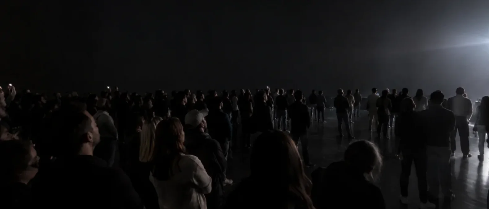
Close your eyes in a good immersive show and the story continues. That is the standard to hit, and sound earns this chapter because it is the most consistently underbudgeted line in projected entertainment, despite doing half the emotional work and a good share of the attention choreography.
Sound Is Spatial Before the Picture Is
Human hearing localises sources all around the head with no effort; vision covers a cone. In a wrapped venue this means audio reaches the audience's sense of "everywhere" before the image does, and does it in the dark, behind them, above them. Spatial mixes, dozens of channels feeding loudspeakers distributed around and above the space, are the audio equivalent of the wraparound canvas, and object-based mixing (a sound placed at a position, not in a speaker) has made them practical to author and to tour. The design rule mirrors the visual one: the mix should behave like a place, not like a public address system.
Placement Against the Picture
With image on every wall, every loudspeaker position is a negotiation. The options: speakers in the open, puncturing the picture (acceptable in arena and stage forms, corrosive in immersive halls); speakers at the seams, ceiling and floor edges, workable but top-heavy mixes flatten the world; or speakers behind the image, which is what the Acoustically Transparent family is for. Behind an AT canvas, the sound arrives from inside the picture, a voice from the figure on the wall, wind from the painted horizon, and the audiovisual illusion fuses in a way separated systems never quite achieve. The physical price: an AT weave passes light as well as sound, so the loudspeaker cavity must be blacked out and treated, and the insertion loss (small, smooth, corrected with EQ) is part of the system tuning.
Synchronisation and the Score
Technically, audio is the show's clock more often than not: the playback system chases timecode from the audio rig, and lighting and projection follow, a practice inherited from concert touring and covered on the systems side in part three. Creatively, the score is the loop's architecture: in loop-form shows, audiences orient by the music, sensing where they are in the cycle the way filmgoers sense an approaching finale, and the transitions of the previous chapter are almost always musical events before they are visual ones.
The Low End and the Silence
Two special instruments. Low frequency is felt in the body rather than heard, which makes it the only part of the picture the audience touches: a bass swell under a rising image is a physical event, and dark-ride designers have used seat-shaking frequencies for decades for this reason. And silence, true, engineered silence with the HVAC masked and the mix pulled to nothing, is the audio equivalent of the extinction move from the grammar chapter: the boldest transition available, and the one that makes an audience hold its breath. A venue that cannot get quiet cannot play it, which makes acoustic treatment a storytelling budget line, not a construction nicety.
No Language, or Every Language
The forms travel best when the sound design leans on music, effect and voice-as-texture rather than on narration. Where narration matters, the practical patterns are multilingual sessions, personal audio (headphone or app-based, with its own isolation trade-offs), or the elegant solution: writing the show so the space itself does the telling and the words are garnish. Part one's point about accessibility of meaning is finally an audio decision.
The Canvas: Found or Built
Every projected experience stands on one early decision that most guides never state out loud: whether the thing you project on is found or built. A found canvas is the world as it exists: a cathedral front, a grain silo, an opera house sail, a rock face. A built canvas is a surface you commissioned: a shaped screen, a dome, a scenic object, a mesh that vanishes when unlit. Most of the craft is the same either way. The economics and the physics are not.
The Found Canvas
Found surfaces are why mapping is famous, and part four's outdoor chapter gives the spectacular its due. For planning purposes, what matters is that a found canvas arrives with properties nobody chose, and each one taxes the picture:
- Color and reflectivity vary across the object. A stone façade is five kinds of stone, two of brick and one of pigeon. Every patch returns a different fraction of your light in a different tint, and content has to be graded patch by patch to read evenly.
- Pale surfaces return the city as faithfully as they return the show. Streetlights, traffic, the venue across the square: it all lands on the object and comes back as lifted, dirty black.
- Weather regrades it nightly. Rain darkens limestone by a stop or more and mutes every color calibrated in the dry.
- Geometry must be captured, never assumed. Complex objects want a proper scan: photogrammetry or a laser-scanned point cloud that becomes the 3D model the content is authored against. Architectural drawings lie: buildings settle, ornament gets added, and the drawing was aspirational to begin with. Scan the real thing.
The Built Canvas
A built canvas inverts every one of those clauses. You choose its shape, so the geometry is known before the scan. You choose its finish, so reflectivity is a number on a datasheet instead of a survey finding, and the content grade is one grade. You choose its color, and here we declare our interest: we make black projection surfaces, and immersive venues are where a black canvas earns its keep, because between self-bounce and house light they are almost never truly dark. A surface that returns the projector's light and absorbs the room holds its blacks in conditions that turn a white screen gray. The full physics lives in the field guide, with the grade ladder and its caveat attached: darker grades ask more of the projector, and the right grade is a calculation, never a slogan.
Shape is the part that surprises people. A tensioned surface does not have to be a rectangle. Curves, cylinders, cones, faceted volumes, full domes, long ribbons wrapped around an atrium: if a frame can hold the geometry, the material can be patterned, welded and tensioned to it, and the elastic behaviour that makes that possible is documented on the build data page. Three families cover the useful cases. 100% Opaque (OP) is the workhorse: nothing behind it shows through, nothing leaks out the back. Acoustically Transparent (AT) lets the sound system live behind the picture. Transparent Scrim (TS) holds an image and then disappears when you light what stands behind it, the reveal machine of this part's space chapter.
One boundary worth drawing plainly: a built canvas does not replace the façade show. Nobody wraps a cathedral in fabric, and nobody should. The built canvas is for the cases the found world cannot serve: the immersive hall that needs 360 degrees of image, the scenic object that has to fly out between scenes, the outdoor stage where the "building" has to exist in the first place, the touring show that needs the same canvas in every city. Most large experiential projects end up using both, a mapped structure here, a built surface there, and the two disciplines share every chapter of this handbook.
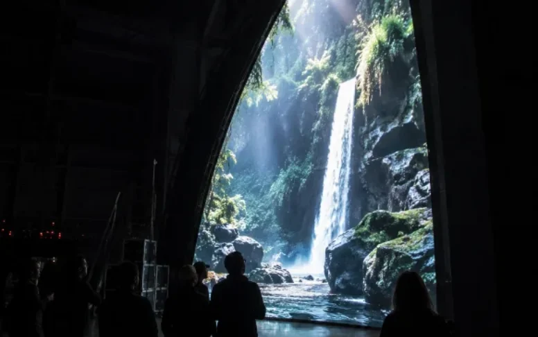
Making the Content
Content is the show, the longest lead item on any calendar, and the line first-time budgets underestimate by half. This chapter is the shape of a content pipeline that arrives on opening night finished, registered to the venue, and graded for the surface it lands on.
Author Against the Real Geometry, from Day One
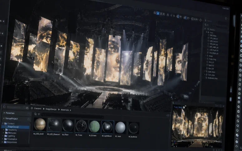
Everything downstream of the concept happens on a 3D model of the canvas: the scanned building, the venue's architectural model, or the built canvas's fabrication geometry. Styleframes are painted onto it, animatics play on it, and review happens inside it, a virtual camera standing where the audience will stand. Teams that author on rectangles and "adapt later" pay for it twice: once in the adaptation, and once in the design compromises that surface only when the content meets the geometry. The model is also where the previsualisation lives, and the planner holds the projector side of that same truth: geometry decided at a desk is geometry that does not surprise anyone on a lift.
The Pipeline's Beats
- Concept and styleframes. The look of each scene, painted still, on the geometry. This is where the creative argument happens cheaply.
- Storyboard and animatic. The show in time, rough, with the score's skeleton. For spatial work this includes the floor-plan script from the writing chapter: where the audience is, and what they face, at every beat.
- Animation and iteration. The long middle. Weeks to months for minutes of finished picture, with review cycles on the model and, as early as possible, on the real thing.
- Grading for the surface. A found canvas needs patch-by-patch compensation for its mixed materials; a built canvas needs one grade against a known finish, which is one of the quiet productivity gifts of commissioning the surface. Either way the grade happens against the black floor and white point the venue can actually produce, numbers that come from part three or from the configurator, not from a reference monitor in a grading suite.
- Render and delivery. To the net canvas resolution after blend overlap (the arithmetic is in part three's pixels chapter), in the color space the playback system will actually reproduce, at the frame rate the servers will actually run. Every one of those clauses has ruined an opening week somewhere.
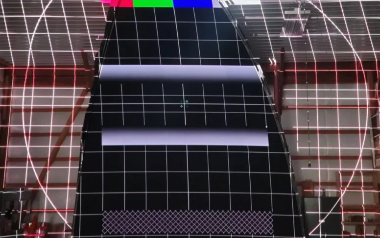
- Registration content. Alongside the show: test patterns, edge traces and alignment scenes built from the same model, which are what the commissioning crew lives in during the final weeks, and what the automated alignment of part three re-checks against for the run's whole life.
On-Site Time Is Not Optional
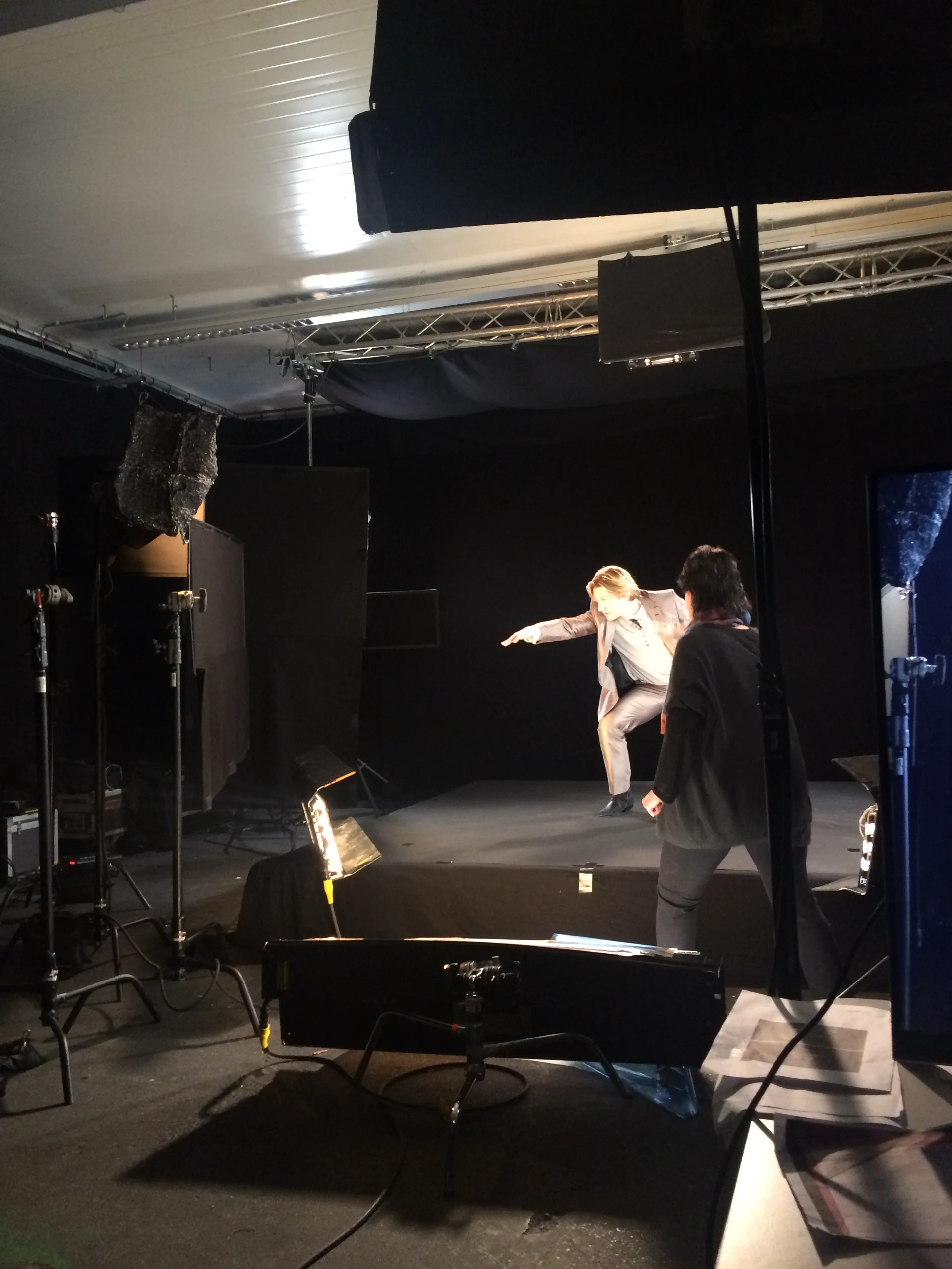
However good the previz, content meets reality in the venue: the real surface's texture, the real black floor, the real bounce, the real audience sightlines. Budget nights with the content team in the space while changes are still cheap, because the grade that looked right on the model always moves, the pale scene that lifts the whole venue's black gets discovered here, and the difference between a good show and a great one is usually two weeks of on-site iteration that someone had the sense to schedule. Dry runs and their discoveries belong to part four.
The one-page agreement that prevents the classic disasters: the 3D model and its tolerance; net canvas resolution per zone and total; frame rate; color space and the venue's measured white and black; the loop length or show duration; the audience plan (where they stand, how long they stay); the register of permitted moves (may the silhouette be broken? may the room go fully dark?); delivery format and naming; and the review schedule with on-site dates. Two hours of arguing about this document saves two weeks of rendering the wrong thing.